 |
| Paul Revere |
With the long awaited release of the complete
The Famous Adventures of Mr. Magoo, it’s finally possible to get a clear overview of the series. While this show will be nostalgic for those who grew up with it, probably the most intriguing aspect to be revealed by this release is the production design and color styling. There were hints of the quality of the production design in previous bootleg copies and in the few backgrounds that were discovered during the research process for the book on
Christmas Carol. However, this set of discs shows that despite the abbreviated schedule, the layout and backgrounds put a high sheen on otherwise factory-level work.
 |
| Treasure Island |
Many of the same artists responsible for the look of
Mr. Magoo’s Christmas Carol were responsible for
Famous Adventures-from character designer Lee Mishkin to layout artists Dick Ung and Bob Singer to painters Robert Inman and Gloria Wood. Due to the intense demands of production, seven episodes out of the 26 were sub-contracted to GrantRay Lawrence (the studio set up by former MGM animators, Grant Simmons and Ray Patterson)
:Three Musketeers, Snow White, A Midsummer Night’s Dream, The Count of Monte Cristo, Captain Kidd, Sherlock Holmes and
Don Quixote, Part 2. There are three distinct blocks of credits for the shows and they are most likely generic; in many cases the credited artist may or may not have worked on that particular show and others who did, might not be credited.
 |
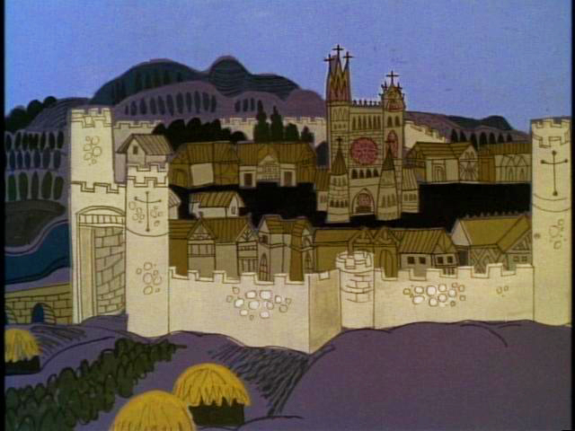
| Gunga Din |
The first in the series,
William Tell, although nicely styled is rather traditional in its palette. By the second episode, a bit of the artistic flair the studio was once known for begins to creep into production.
Gunga Din has a limited palette but with its broad vistas and rocky hills devoid of vegetation, it gives a good visceral feel of the unrelenting heat of India. Contrast the hot oranges in the landscape dramatically accented by purple shadows with the restful, cool palette used for the interiors.
 |
| Moby Dick |
Colors in
Moby Dick are less dramatic but are striking in their harmony-note the warm accent in the otherwise cool palette in the example at right. It’s also the first episode with both the subjective and expressive use of colors on the characters. Characters are often made more interesting simply by the use of color and certainly took full advantage of the new medium of color television.
 |
| Treasure Island |
 |
| Cyrano de Bergerac |
Treasure Island features strong layouts by Bob Singer and some very painterly backgrounds by Gloria Wood. Here, too, characters are colored in a non-literal fashion adding to their appeal. This episode has a particularly epic feel to it with its styling.
Cyrano DeBergerac has a strong architectural component to it, featuring strong draftsmanship by Jacques Rupp, about whom you'll hear more in an upcoming post. Color palettes feature a diversity of looks, with some very clean palettes like the one at right along with some very dramatic palettes (see page 100 in my book.)
 |
| Noah's Ark |
The backgrounds by Bob Inman in
Noah’s Ark are more traditional in painting technique but utilize unusual colors featuring hot pinks against cooler colors. This episode features nice design styling by Bob Singer.
 |
| King Arthur |
Showing that the artists weren’t into color for its own sake, there are some nicely subdued color palettes in
King Arthur and
Rip Van Winkle,
Rip being a bit more painterly in execution.
 |
| Robin Hood |
Robin Hood, perhaps the most epic episodes in the series, was designed and laid out by Bob Singer and painted by Bob Inman. Some sections, like the one pictured at right, were fairly conventional in painting technique. Scenes of the exterior and inside the castle dungeon feature palette knife work for texturing the stone walls.
 |
| Doctor Frankenstein |
One of the stronger entries,
Doctor Frankenstein features Gloria Wood’s Expressionist painting style which adds immeasurably to the eerie feel. More than any other episode, this one closely approximates her work in the graveyard sequence in
Mr. Magoo’s Christmas Carol. It also comes the closest to the kind of stylistic expression UPA was once known for, in films like
The Telltale Heart. You can buy
The Famous Adventures of Mr. Magoo as part of the boxed set
Magoo on TV here.


2 comments:
Famous Adventures layout artist Bob Singer writes in:
Thanks for alerting me to your latest post on Mr. Magoo's Famous Adventures. I enjoyed seeing some of my old work again, and in color. I remember spending a lot of time finding reference material in books and library files in order to make my designs look authentic, especially at the Brand Library in Glendale. They had been gifted with the research library from MGM and I put it to good use on several projects. The richest source of material was found in old movie stills such as Robin Hood, Treasure Island, the Frankenstein movies, Sinbad and Gunga Din.
Great blog! I rediscovered Mr. Magoo, the 1960 version on Hulu today and am wowed by the backgrounds.
Post a Comment