Mr. Magoo's Christmas Carol

A blog dedicated to the making of the first animated Christmas special, Mr. Magoo's Christmas Carol.

Monday, September 27, 2010

Ronald Searle and Mr. Magoo's Christmas Carol


The British Invasion as a pop cultural reference usually refers to the wave of British bands that began to infiltrate American pop music starting in 1962. However, there was a sort of pre-British Invasion when it came to the culture in general. The vanguard was led by several British-themed musicals and plays in 1960-Robert Bolt’s A Man For All Seasons, Lerner and Lowe’s Camelot and most importantly for Mr. Magoo, Oliver!, with music, lyrics and book by Lionel Bart and based on Charles Dickens’ Oliver Twist.


Shortly after the debut of the Dickens musical, an edition of A Christmas Carol with illustrations by Ronald Searle, the renowned British cartoonist, was published. (World Publishing Co., copyright 1960, 1961.) Searle illustrated two more of Dickens’ works, Great Expectations and Oliver Twist, both published in 1962. The Magoo special had its debut on the NBC network in December 1962.


It appears that Dickens was experiencing a bit of a cultural renaissance and both Bart’s musical and Searle’s book had a hand in the genesis of Mr. Magoo's Christmas Carol. The success of Oliver! clearly influenced the decision to make an animated musical based on A Christmas Carol and Searle's book seems to have inspired the artists at UPA as they designed the special-a UPA stamped copy of the book was found in Abe Levitow’s personal collection of material from the film.

Ronald Searle

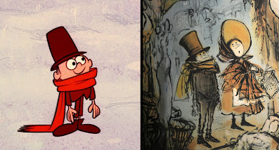
Below are a few indications of Searle's influence: 

This early pre-production art shows the strongest Searle influence, artist unknown

A greatly simplified version of the fiddler by designer Lee Mishkin


Lee Mishkin simplified Fezziwig's and his wife's costumes for animation

Searle's drawing from the book has been flopped  for comparison

Tony Rivera's design for the turkey boy as animated by Duane Crowther

These few designs by Lee Mishkin and Tony Rivera unfortunately pale in comparison to Searle's florid line work but the two were working in a different discipline and constricted by production methodology and budget. Viewed by themselves, the designs are extremely appealing and contribute enormously to the charm of the film.

Mishkin was not alone in referencing Searle; many of his contemporaries were also influenced by Ronald Searle's work. In fact, Searle caught Disney designer Tom Oreb poaching what he felt was his horse design for Samson in Sleeping Beauty, and the host and contestants on "What's My Crime?" in 101 Dalmatians, also designed by Oreb, have a distinctly Searle feel to them. Even the line work in the backgrounds for 101 Dalmatians,created by layout man Ernie Nordli, echoes Searle's own backgrounds.

To see more from Ronald Searle's lavishly illustrated edition of A Christmas Carol, as well as his other Dickens' editions, click here.


Monday, September 20, 2010

Phill Norman, titles

On an irregular basis, I will be doing a few in-depth profiles of some of the cast and crew since the special was only a tiny part of their careers.  First up, as befits a title artist, is Phill Norman.

Phill Norman, 2007
The iconic title lettering for Mr. Magoo’s Christmas Carol was done by Phill Norman, who also painted the title cards and all the lettering in the special, although he’s listed as a “color stylist” in the credits for the film. (For you font-a-holics, Phill’s hand-done work is most closely approximated by Latino Rumba for “Mister Magoo’s” and Ed Benguiat Interlock for “Christmas Carol” with a smattering of Coop Condensed thrown in for good measure. The second font was fairly commonplace during the early 60s-other examples can be found in The Alvin Show and My Favorite Martian.) 

In fact, Phill was responsible for all the title work, credits and lettering that ran through the studio but would occasionally paint backgrounds. Norman had one of the more unusual entrées into the animation field as he told it:

I had a friend that I had gone to high school with who worked there (at UPA). He had come out to California before me. I came out here on vacation and had lunch with him and some other guys from the studio. For some reason or another, in talking, they offered me a position and I didn't go back. I didn't finish the vacation. I went to work there a couple of weeks after that and I worked there for I think about 2 ½ or 3 years, something like that. I worked on a number of projects there. From that I went into doing main titles for movies and TV.

Phill had no prior experience painting, either for titles or for animation, although he had attended art school in Indiana for three years before accepting the job. His timing, though, couldn’t have been better. UPA had just ramped up production with 130 Magoo shorts and 130 Dick Tracy shorts, all of which needed titles and credits. Phill not only did the lettering but designed the title cards for each short as well. Owing to the fast pace of production, design, approval and execution for each of these were done in hours, rather than days.
A sampling of Phill's Magoo title work

When production ceased on the shorts, Norman left UPA to work at the John Sutherland studio for about six months doing industrials. (At one time or another, many of the field’s top talents worked for Sutherland-Eyvind Earle, Tom Oreb, Maurice Noble and Irv Spence to name a few.)

Phill came back to UPA to work on Gay Purr-ee, where this time, in addition to his title and lettering chores, he painted backgrounds. After Christmas Carol, Norman left UPA and freelanced for Pacific Title on the feature, Days of Wine and Roses. They liked his work well enough that he was asked to join them and spent the next three years there doing title design (once there, he left the hand lettering to those with an especially deft touch). He decided to strike out on his own in 1965, and despite a rocky start, he began to make a mark doing titles for television shows. Not long after he hung out his own shingle, he was outside talking to his across-the-street neighbor:

We started talking and he said 'What do you do?' and I said 'I design main titles.' I said 'What do you do?' and he said 'I produce television shows.' I said 'Really? Like what?' and he said 'Well, I produce 'The Fugitive' and I got one coming up called 'The FBI'. It was Quinn Martin.

He said 'Do you have anything on film?' Luckily by that time I had a few things on a reel and he told me to send it over. People say these things but you never know if they mean it. Next day I get a call and he said 'Where is that reel?' and I said 'Well, I will get it over to you right away.' I did and I did all his work after that, main titles for his shows. 'The FBI' was done, but I did 'The Streets of San Francisco', 'The Invaders', and all the stuff he did after that. He was a great guy to work with, he really was. It was just one of the few times when one person had a say about things. The word got quickly around for TV. In fact I had so much TV work that I had trouble having time to search out some of the movies I wanted to work on. It worked out okay and I did a lot of 'Kojak' all that kind of pop stuff in that period.


Phill Norman went on to do the main title design for dozens of TV shows like Dynasty, Charlie’s Angels, The Love Boat and feature films like The Way We Were, Ordinary People, On Golden Pond and even What’s Up, Tiger Lily? (see page 97 in the book for more info on the UPA tie-in). He was nominated six times for Emmys and won three-for QBVII, The French Atlantic Affair and Shogun.

Phill retired in 1999 and died unexpectedly July 11, 2009 after a short illness.

Wednesday, September 15, 2010

Back in print!


I'm pleased to announce that the book will be back in print beginning October 15th.  I'm also happy to report that this edition is being printed domestically and the proofs I've seen are even better than they were for the first edition.  How that will translate to the final printing is anyone's guess but it's looking very good at this stage.  There are some minor text revisions in this edition, based on new information that came to light after the first edition went to press, and I will list those changes in a later post.  You can pre-order the book by clicking here.